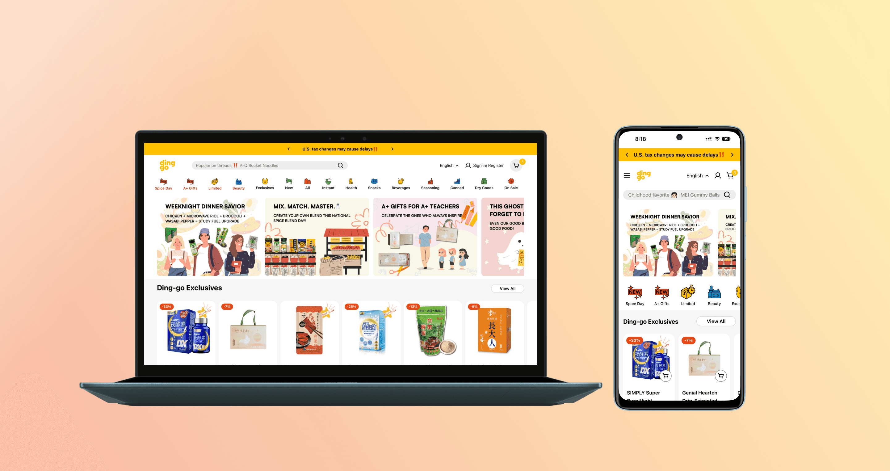
Mobile-First Homepage Redesign with AI-Accelerated Deployment: +52% Add-to-Cart Rate
Outcome
What's Ding-go?
Ding-go (a BLIVE GLOBAL brand) is a direct-to-consumer e-commerce startup that curates authentic Asian snacks, beverages, beauty, and specialty foods from Japan, Korea, Taiwan, and beyond for Asian diaspora communities across the U.S. As an early-stage online retailer with limited runway, it relied on mobile traffic from marketing ads to grow, so turning that traffic into sales was critical to proving product-market fit.
Problem
Marketing ads drove strong traffic, but users bounced within seconds before ever seeing the products.
Unique Challenge
Balanced brand storytelling with usability, limited engineering bandwidth meant designers used AI to build components directly.
Process
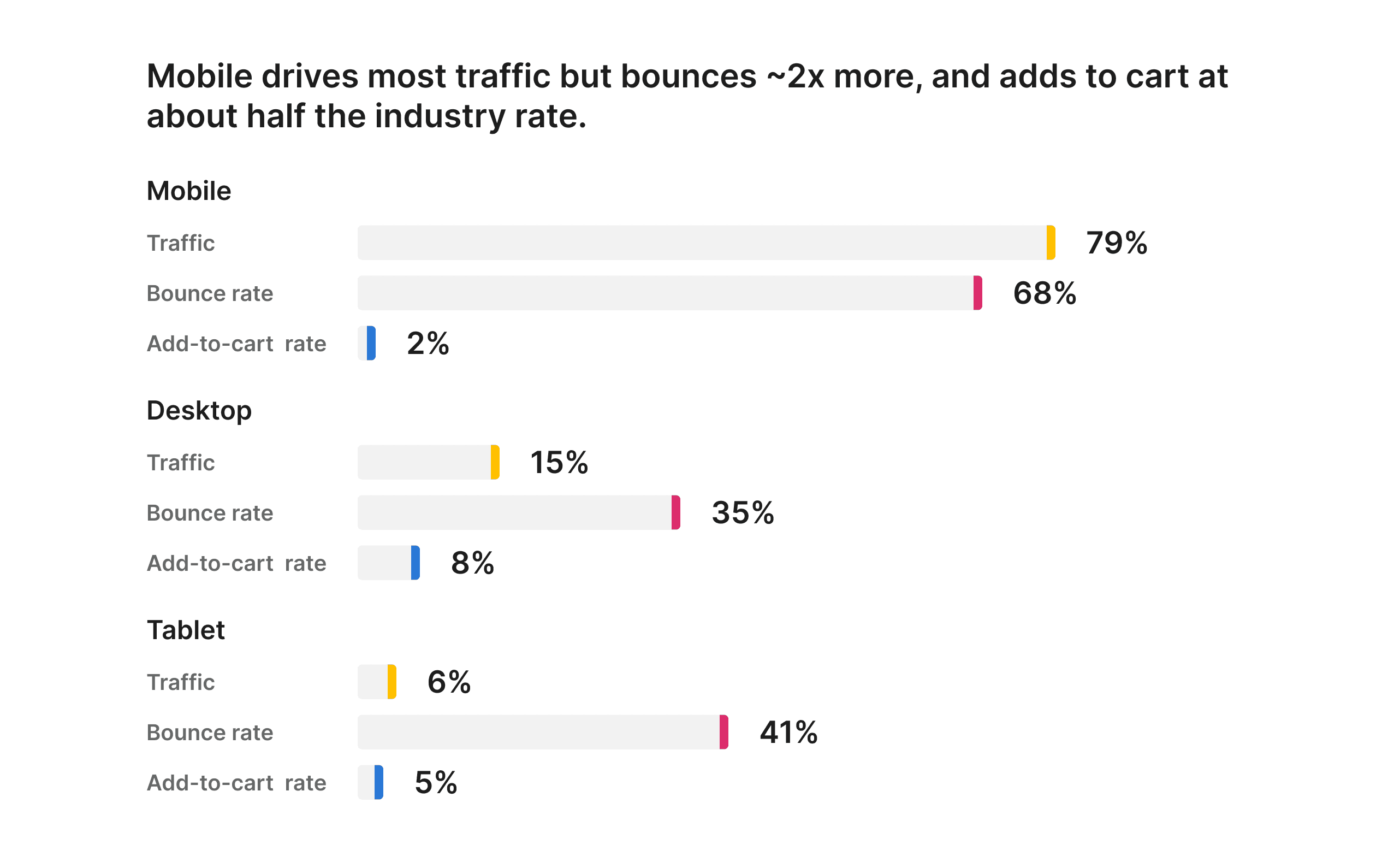
Where and When Users Dropped Off Our Website?
I conducted a UX audit, Hotjar session analysis, and Google Analytics review to uncover why users dropped off our website and failed to convert into buyers.
Aligning on Priorities with the CEO
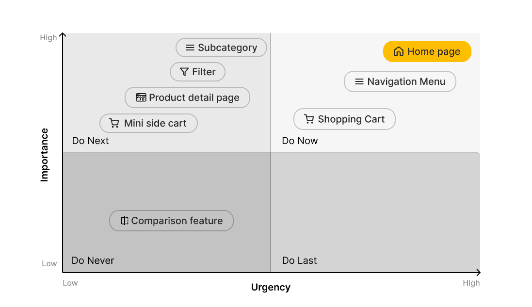
I analyzed every mobile page by effort, design impact, and urgency, then presented the matrix to the CEO to confirm the roadmap. We agreed to redesign the homepage first.
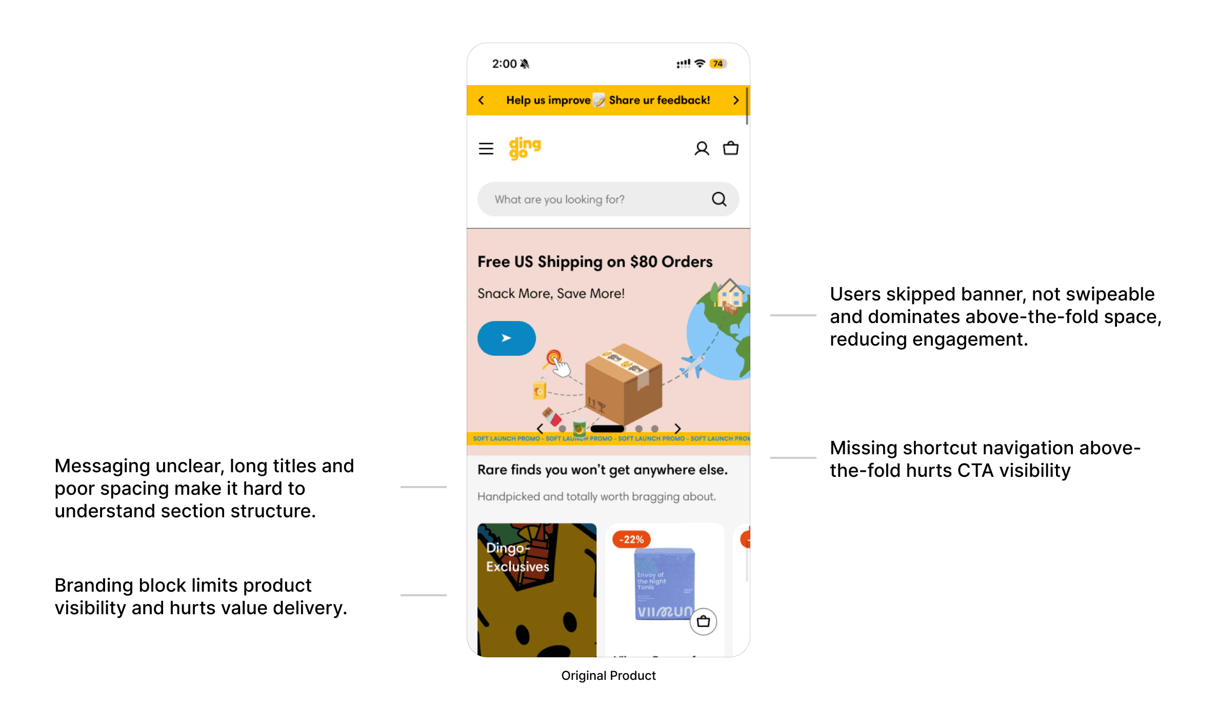
Users Dropped Off Due to Poor Mobile Usability
Session replays and analytics revealed that users quickly scrolled past the banner and exited. Key CTAs were buried below the fold, making it hard to navigate. Combined with cluttered content and inconsistent layout hierarchy, the homepage failed to deliver clear value, hurting both scanability and user trust.
Prototyping & Feedback
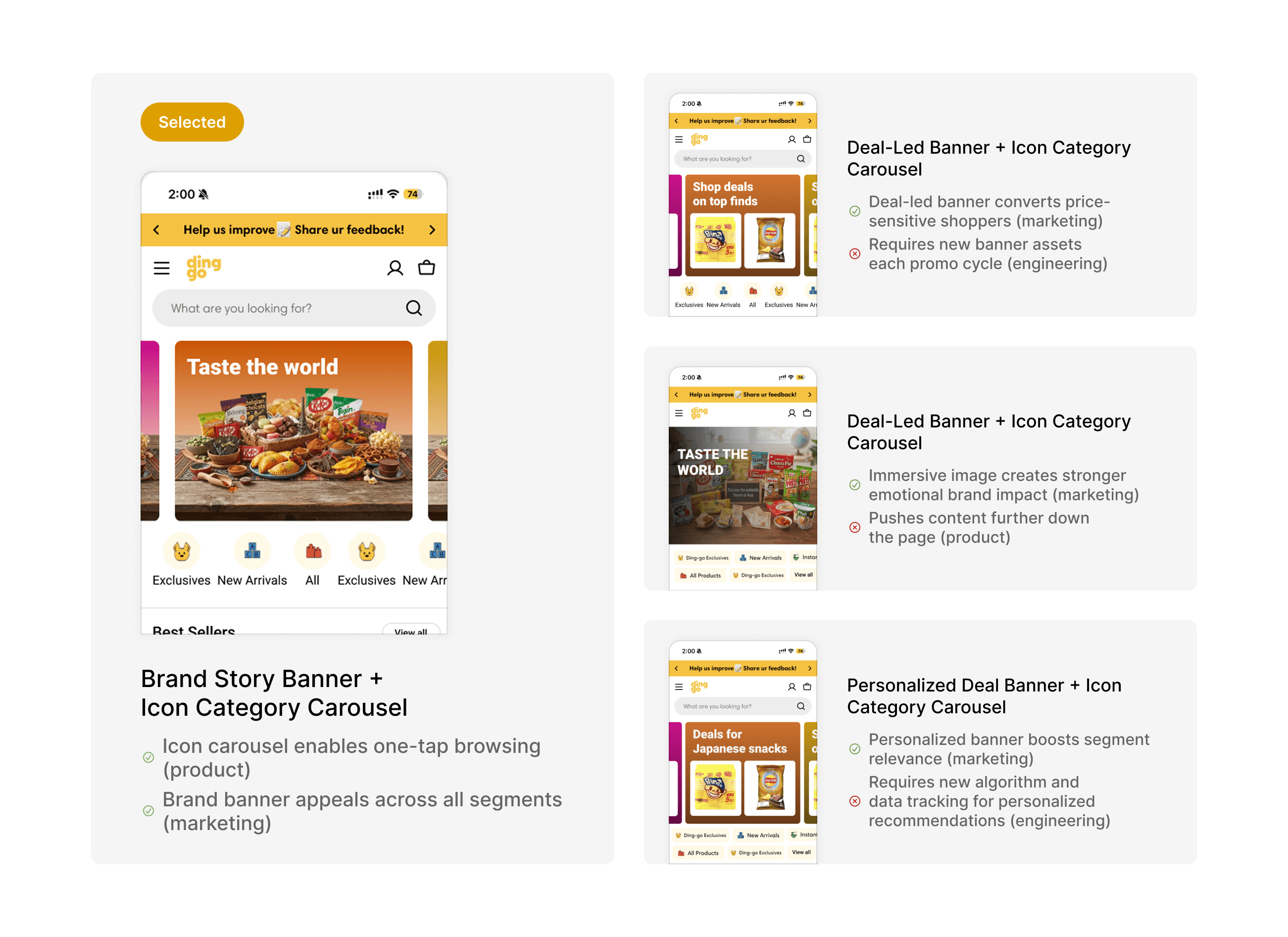
With the pain points surfaced in research, I developed four visual directions in Figma, then collected feedback from marketing, engineering, and product teams.
Front-End Deployment with AI Agent
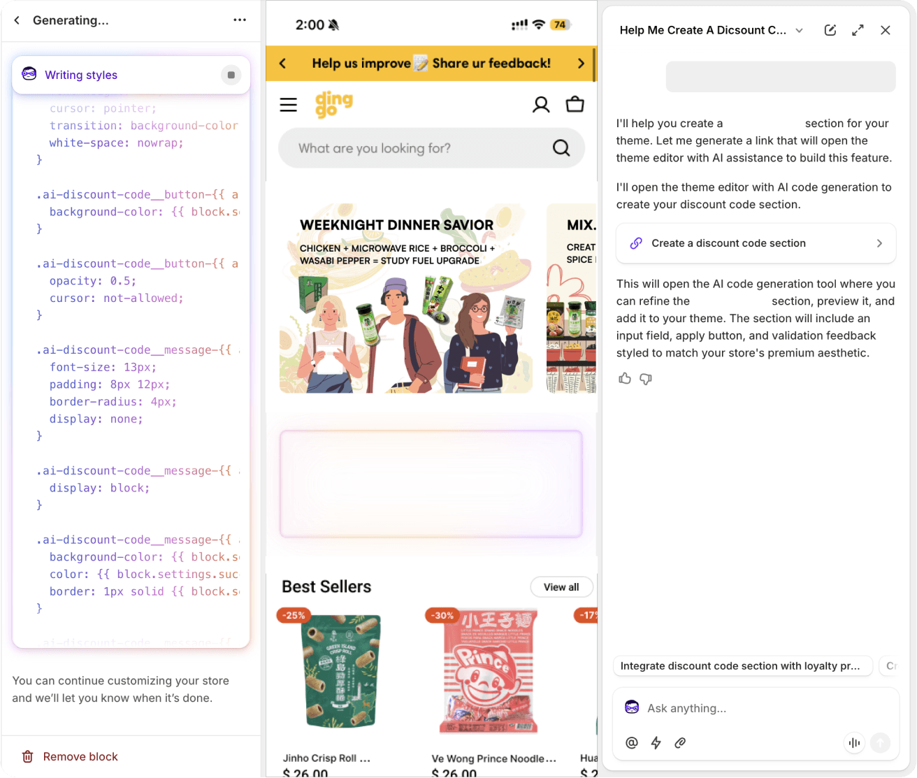
With limited engineering bandwidth, I built and shipped the storefront's front-end myself using Shopify's AI agent. I wrote the prompts, reviewed the generated Liquid and CSS, and tested each section on different devices in the live theme before release.
Prompted from design intent
Described each component's behavior and brand styling, like the discount code section.
Reviewed code
Refined generated CSS for interaction states and tied colors to theme settings for easy customization.
Closed the design-to-production gap
Designing and deploying in one loop removed handoff delays and kept the UI faithful to the mockups.
Final Design
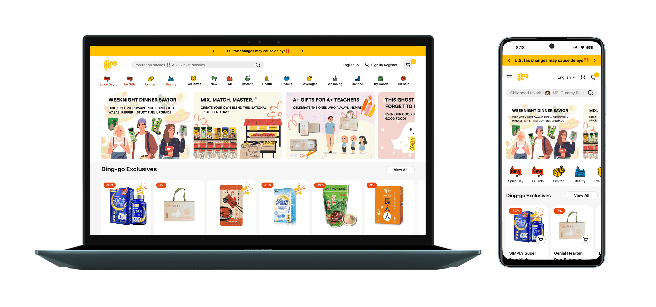
Key Deals Above the Fold Cut Friction, Lifted Engagement
PROBLEM SOLVED
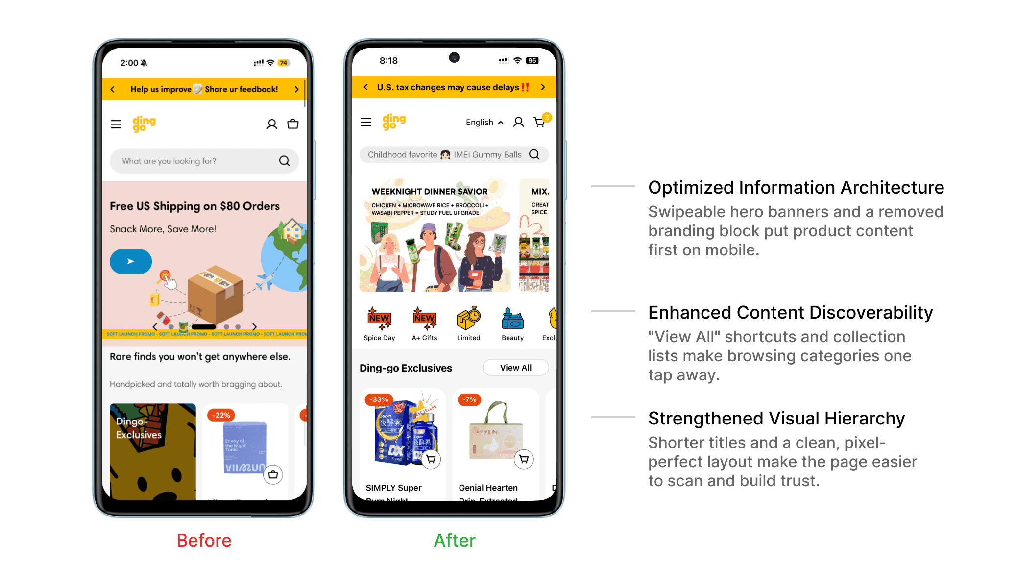
Users scrolled past the banner, missed categories below the fold, and got overwhelmed by cluttered messaging.
HOW
Touch-friendly category shortcuts now sit above the fold. The banner is shorter, creating clear hierarchy between content and CTAs.
WHY
Clarity-first design helps users grasp value instantly and interact without extra effort.
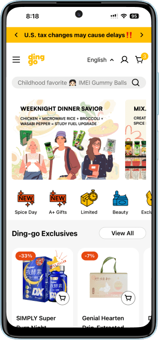
Language Selection & Banner
Added a language toggle for the 73% non-English-speaking user base, and made the hero banner swipeable for faster discovery.
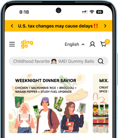
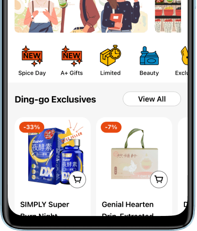
Navigation Menu & Collection Titles
Icon-based navigation speeds up access to categories; shorter titles and an above-the-fold "View All" support immediate exploration.
What I Learned From Unexpected Data Results & Next Steps
Checkout Conversion Outpaced Add-to-Cart Growth Post-Launch
After the homepage redesign, cart additions rose by 26%, but checkouts jumped 49%, suggesting the new layout attracted higher-intent users and reduced friction in the funnel.
Validate Assumptions: Buyer Intent & Drop-Off Insights
Despite the improvement, checkout rates still lag behind industry benchmarks. I’ll review session replays and refine questions for upcoming interviews to better understand cart-to-checkout drop-off behavior.
Next Focus: Shopping Cart Redesign to further improve conversion rate
Clarify pricing, shipping, and discount visibility in the cart, conduct internal usability testing, and streamline the mobile checkout flow for better conversion.