I redesigned the cart experience to rebuild trust, reduce friction, and prioritize key actions.
Product
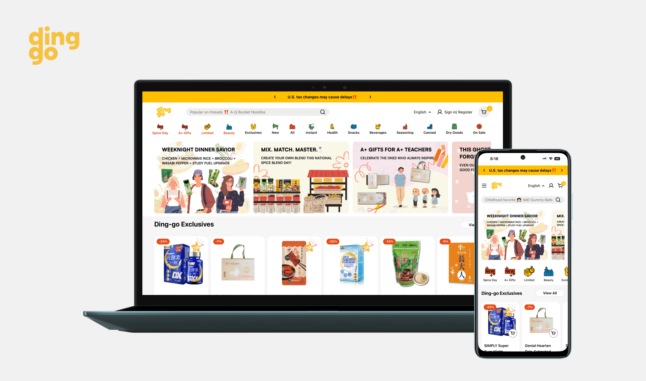
Ding-go website
Skills
Data Analysis, Product design, Stakeholder management, User research & testing
My role
Identifying problem through data analytics
Conducting user interviews to understand hesitation points
Aligning on goals with stakeholders
Prioritizing solutions based on impact and technical feasibility
Delivering mobile-first designs with measurable metrics
Team
UX Team, Marketing Team, Content Team, Development Team
Tool
Figma, Shopify
Key metrics
Increased conversion rate by 32%
Increased reached checkout rate by 2%
Increased checkout completion by 28%
Context
Data revealed that over 90% of users were abandoning their carts, and only 9.7% progressed to checkout, a critical blocker to customer acquisition and revenue growth. While our checkout flow performed well, the cart experience was failing to build the trust and clarity needed to move users forward.
What's the problem? What's the goals?
📈 Business Needs
Increase revenue by improving the conversion funnel. Reduce cart abandonment and help more users complete their purchases.
❓Problem to Solve
The existing cart experience lacked clarity and trust-building elements., leading to a 90.3% abandonment rate.
📍Project Goal
Redesign the shopping cart with a trust-focused, mobile-optimized layout that clearly communicates shipping, pricing, and available actions.
🪨 Challenge
How can we redesign the cart experience under tight engineering resources while ensuring the new flow builds user confidence and supports different payment behaviors across devices?
Solutions
A streamlined cart experience focused on clarity, transparency, and guiding the user toward the next step.
Trust Enhancements
Added estimated shipping dates to reduce hesitation
Moved discount code input from checkout to cart to offer value earlier
Price Transparency
Introduced a clear summary of total costs (including shipping)
CTA Clarity
Separated the primary checkout CTA from quick-pay buttons
Improved visual hierarchy to increase action rates

Process
Vague pricing and checkout friction increased cart abandonment.
To understand cart drop-offs, I interviewed 4 early users, analyzed GA4 data and Hotjar recordings.

Prototyping & Feedback
I created mid- to high-fidelity prototypes in Figma, then presented to marketing, engineering, and product teams.

Quick Win - First Launch
Collaborated with the engineering team to launch the first version of the product, prioritizing key features. This release received positive customer feedback and led to an increased cart conversion rate.

Final Design

Impact
2%
28%
32%
What I Learned From Unexpected Data Results & Next Steps
Why Checkout Completed Rate Increased More Than Checkout Rate
This suggests the redesign helped reassure users during the checkout process, likely by improving clarity around final pricing, shipping details, and discounts, which reduced drop-off after checkout started.
Limited Impact on Reached Checkout Rate: Entry Friction Still Exists
Users might still not see enough value or urgency to move forward. Overwhelming checkout options (like multiple quick-pay buttons) may still cause confusion.
Next Focus: Reduce Pre-Checkout Friction And Streamline Checkout
Run session replays or click maps on the cart page to identify hesitation. A/B test simplifying quick-pay options (e.g., hide them behind a dropdown or reduce visual noise).